
A traditional master bathroom gets a fresh update with luxurious finishes and airy design


This before-and-after story is one very near and dear to my heart - it's my parent's house! They purchased this home about a year ago, and have taken on the renovation of several rooms, including their master bathroom.
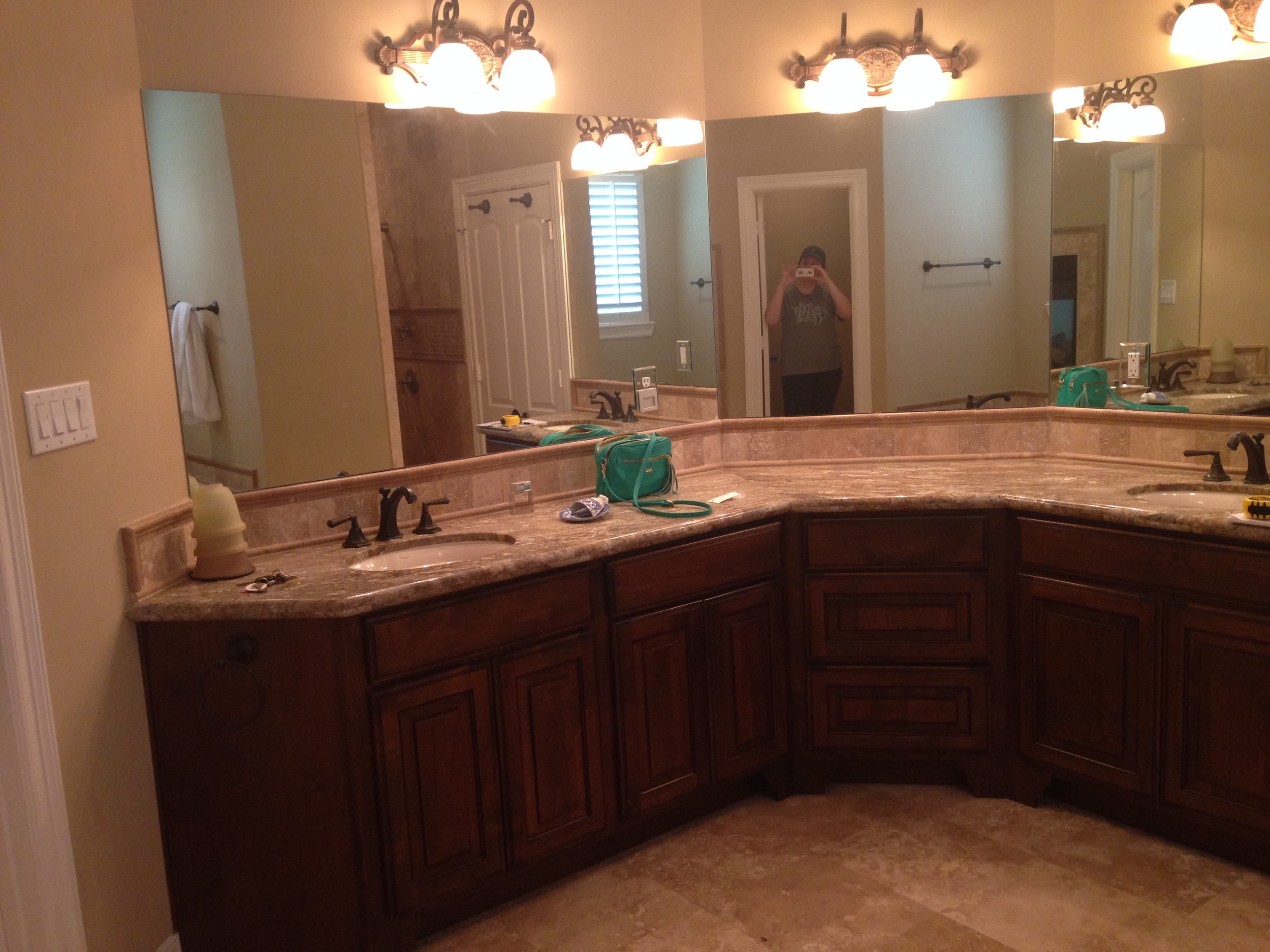
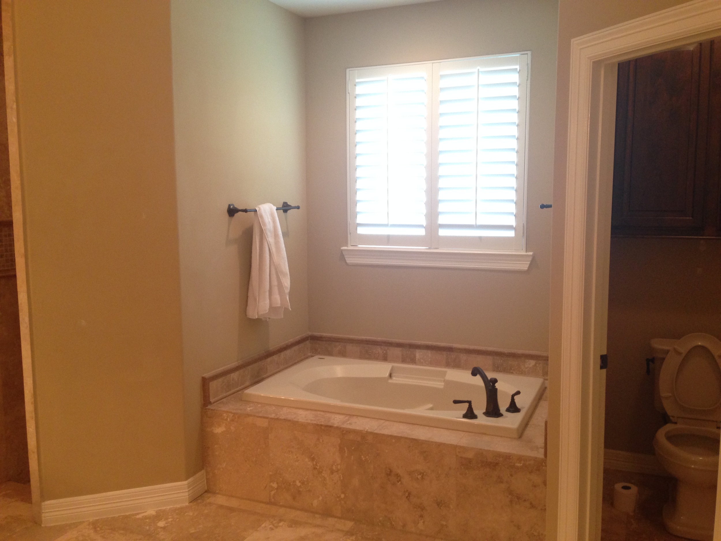
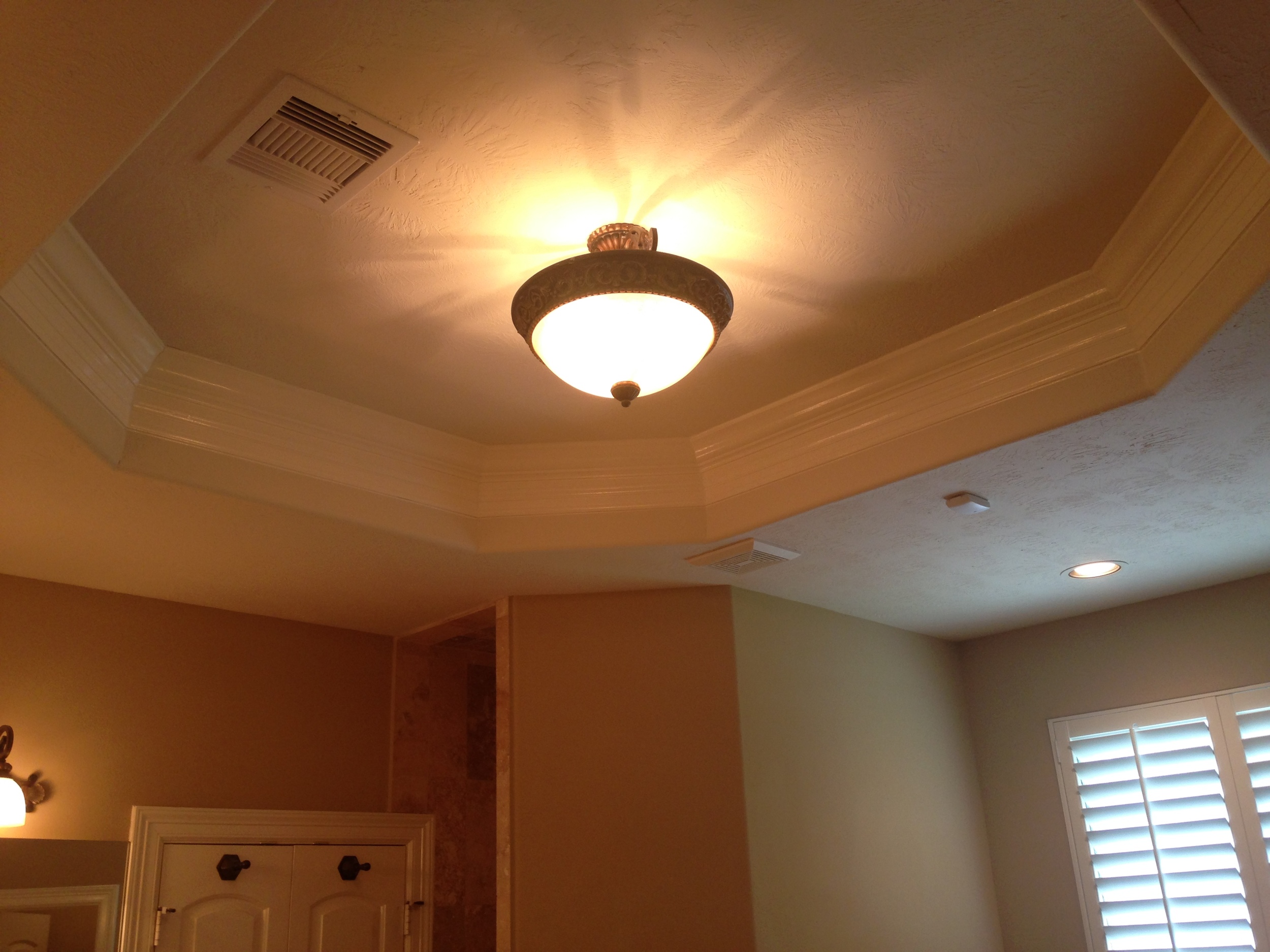
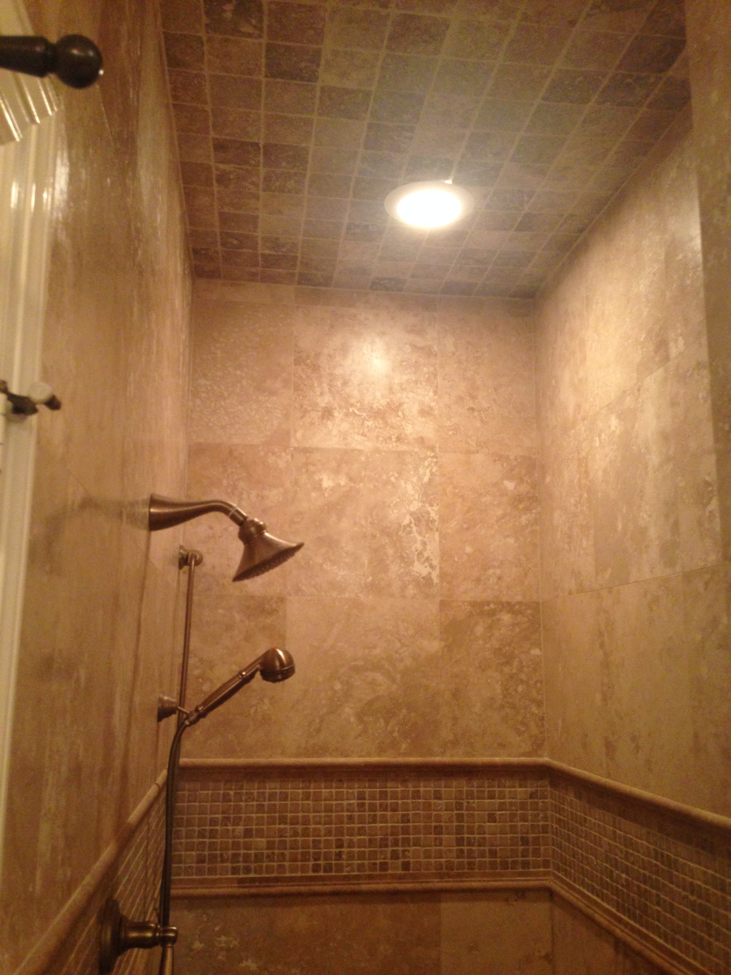
As you will see in the "before" photos, this bathroom was completely fine. Really, it was just fine. Neutral travertine tile, walk-in shower, plenty of counter space, open feel. However, my parents and I felt that we could make the space truly AMAZING! Some of the lighting and hardware was a little dated, and the bathroom generally felt dark and cave-like. We wanted a light and airy aesthetic (throughout the entire house), so some elements needed an update.
Check out this master bathroom before:
BEFORE


Luckily, there were several items that we were able to keep and implement into the new design:
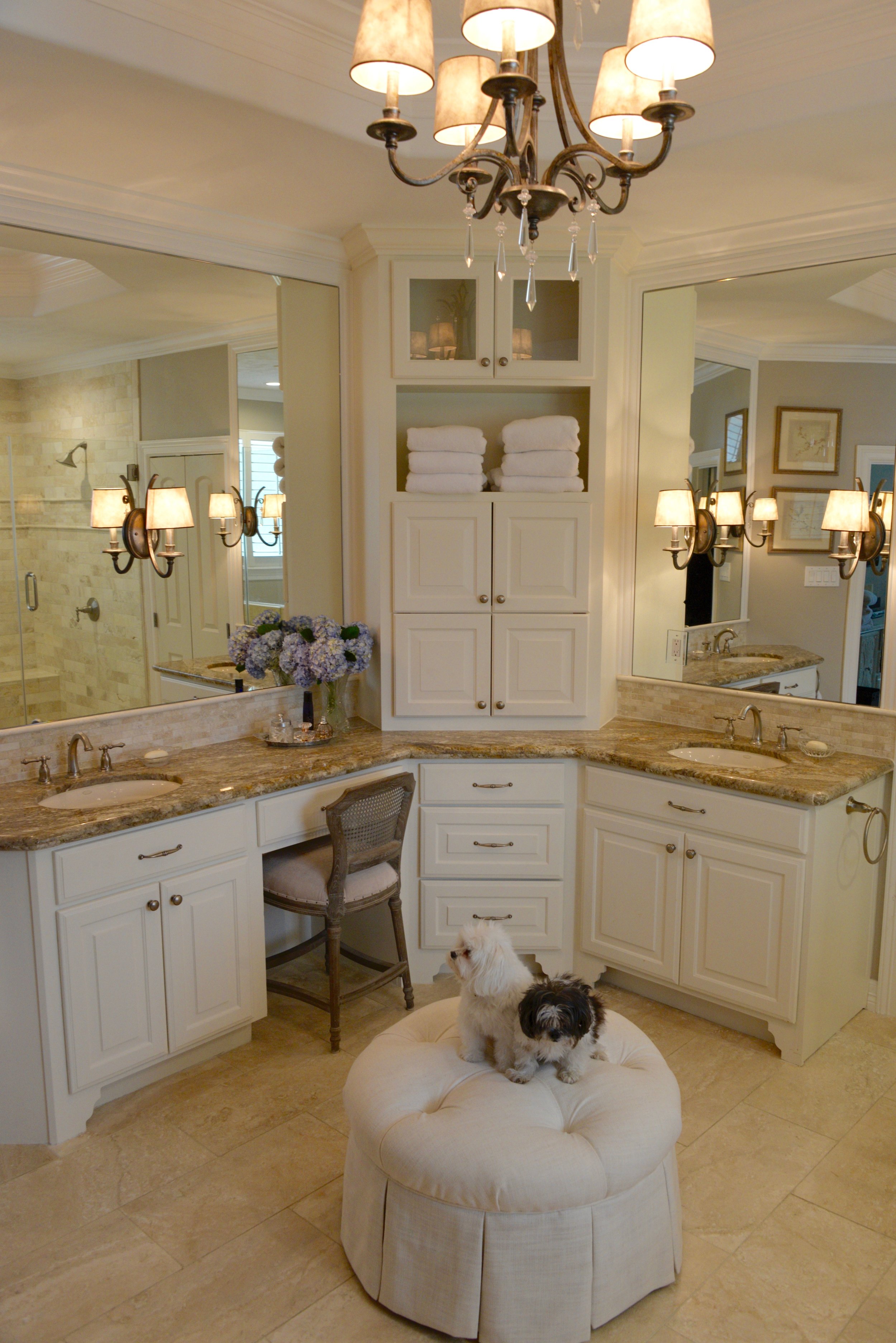
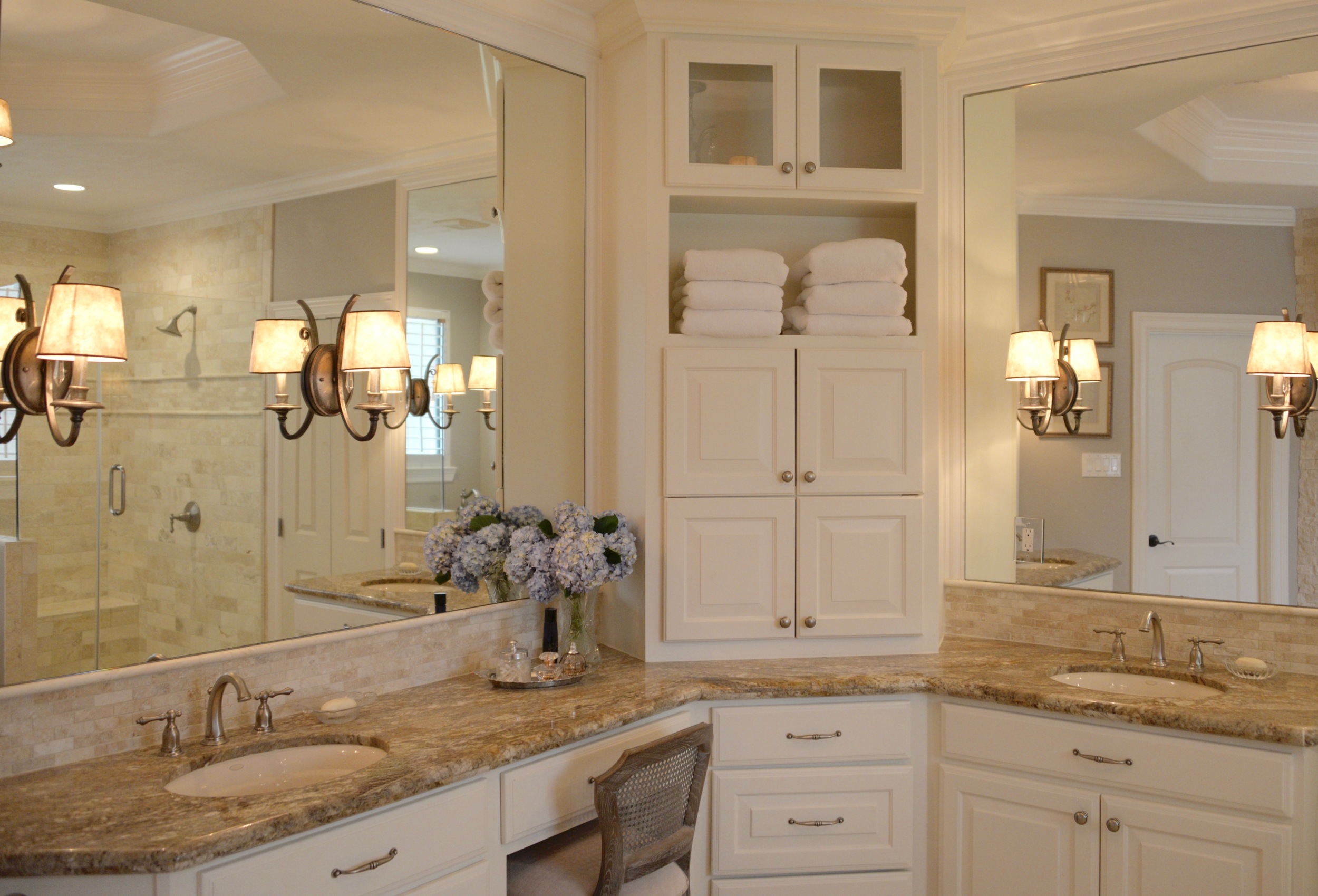
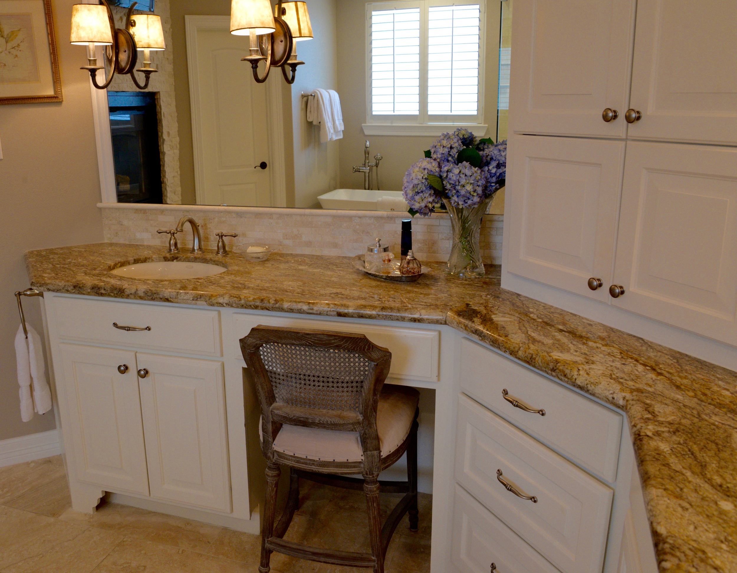
Vanity cabinet - the style and storage were both great, so the cabinet was a keeper. It felt a little dark though, so we lightened things up with white paint.
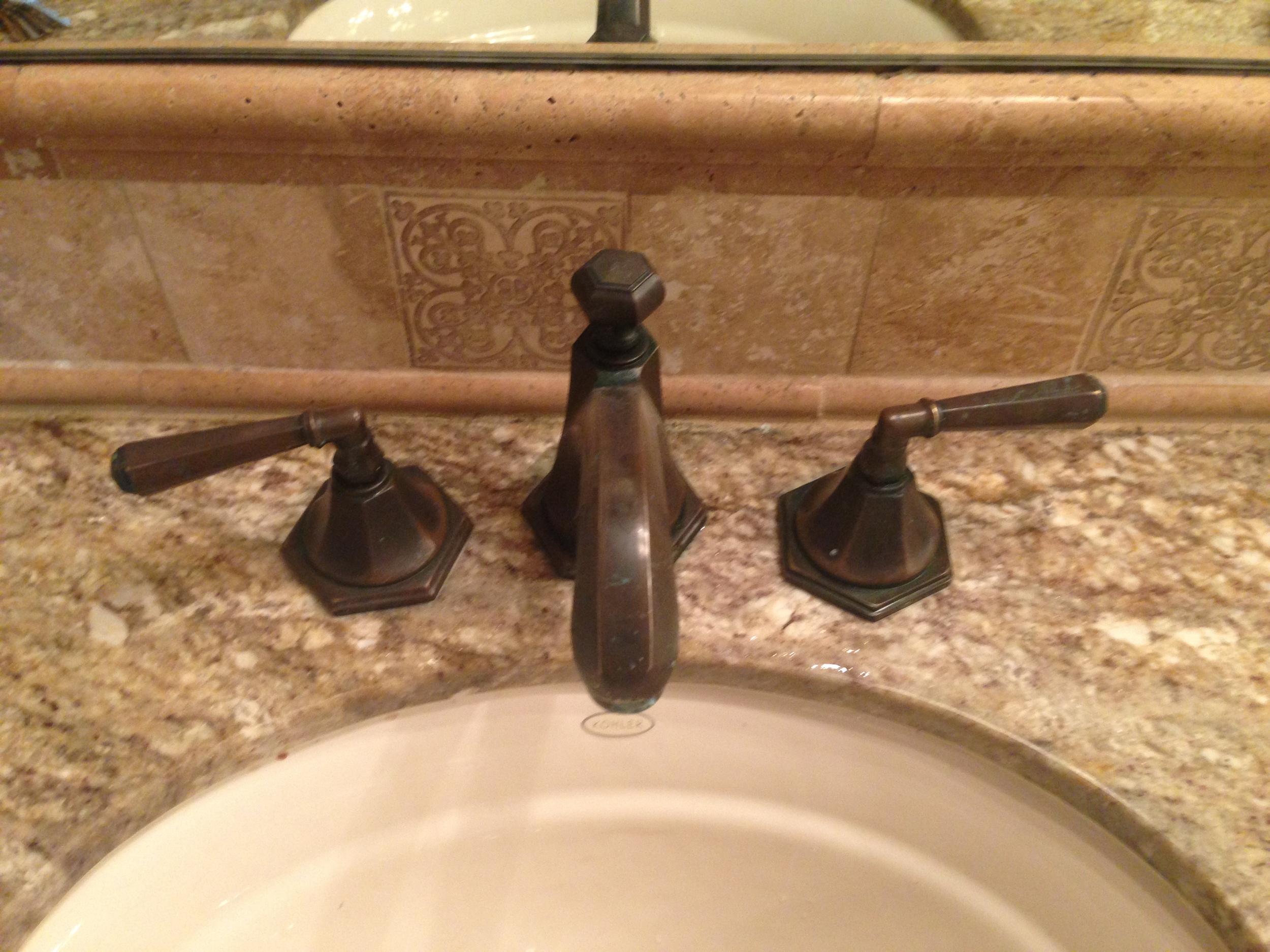
Granite Countertops - The neutral coloring of the granite would still work well with the new color scheme.
Layout - The general layout of the room was well optimized and did not need to be reconfigured - which was an awesome $$$ saver!
To achieve a bright, airy, and luxurious new master bathroom, we needed to change the following:
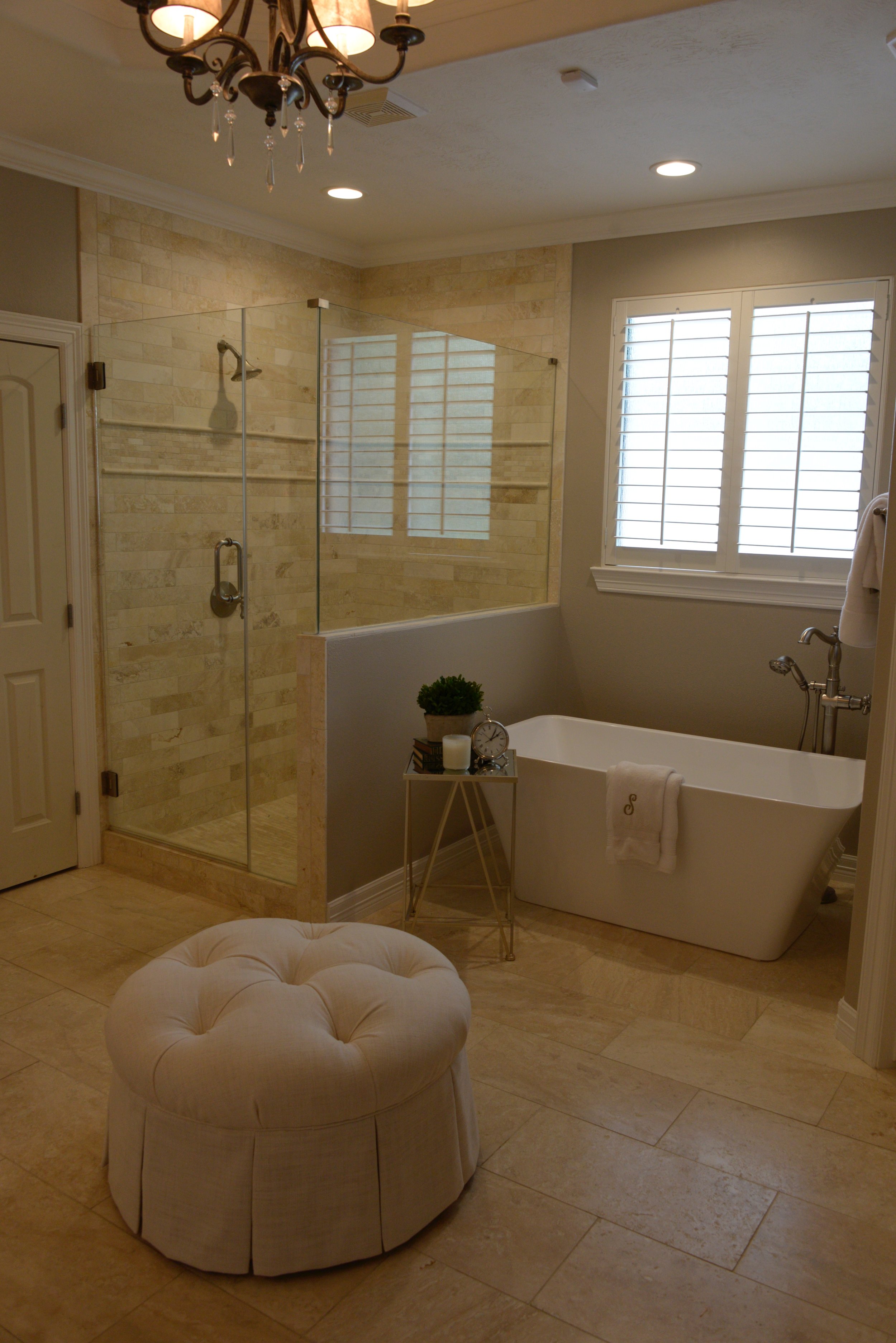
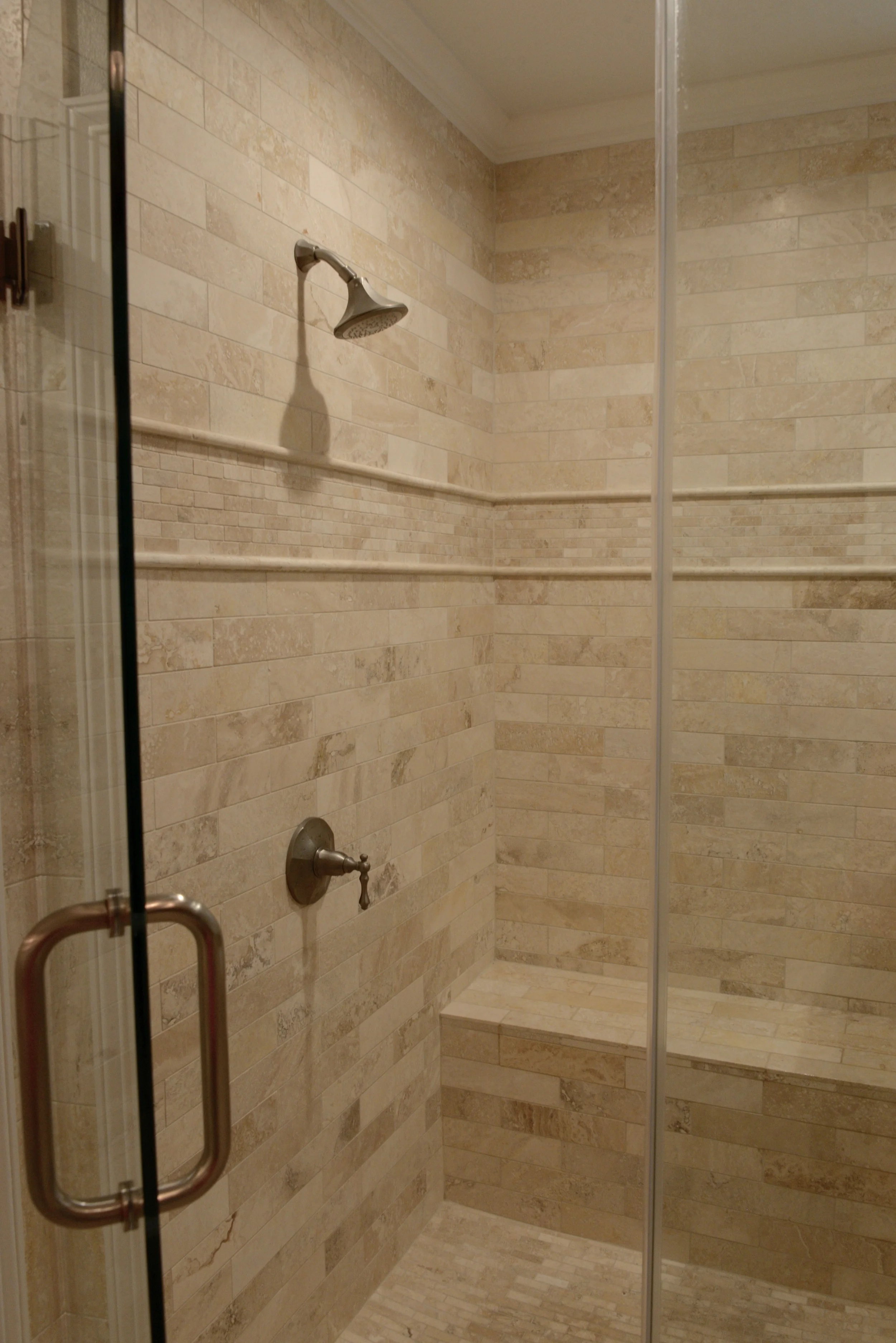
Flooring and Shower Tile - This one was tough to swallow. The existing travertine tile was pretty and very nice.... BUT JUST TOO DARK. :( And it didn't help us feel much better when we selected the new tile, and it was.....also travertine (but in a MUCH lighter shade...we aren't that crazy).
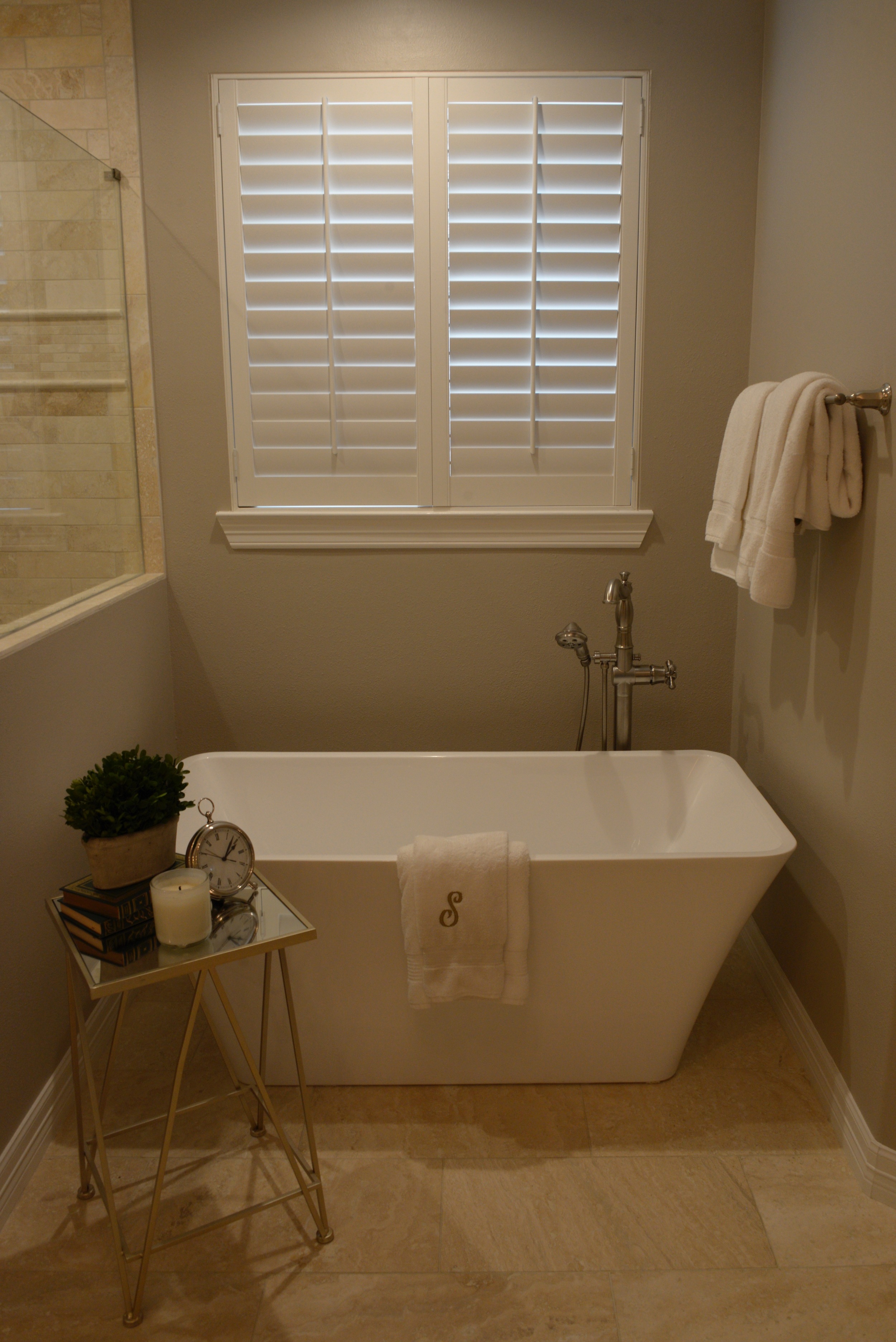
Shower Enclosure - Did you notice in the before photos , the shower was tucked in the corner next to the tub, behind a full height wall? The wall made the shower feel dingy and smaller than it actually was. We needed to remove the shower wall completely to open things up.
Bathtub - My mom was excited to implement a freestanding bathtub (more for looks than for use). Freestanding tubs always act as a sculptural and elegant addition....very spa-like.
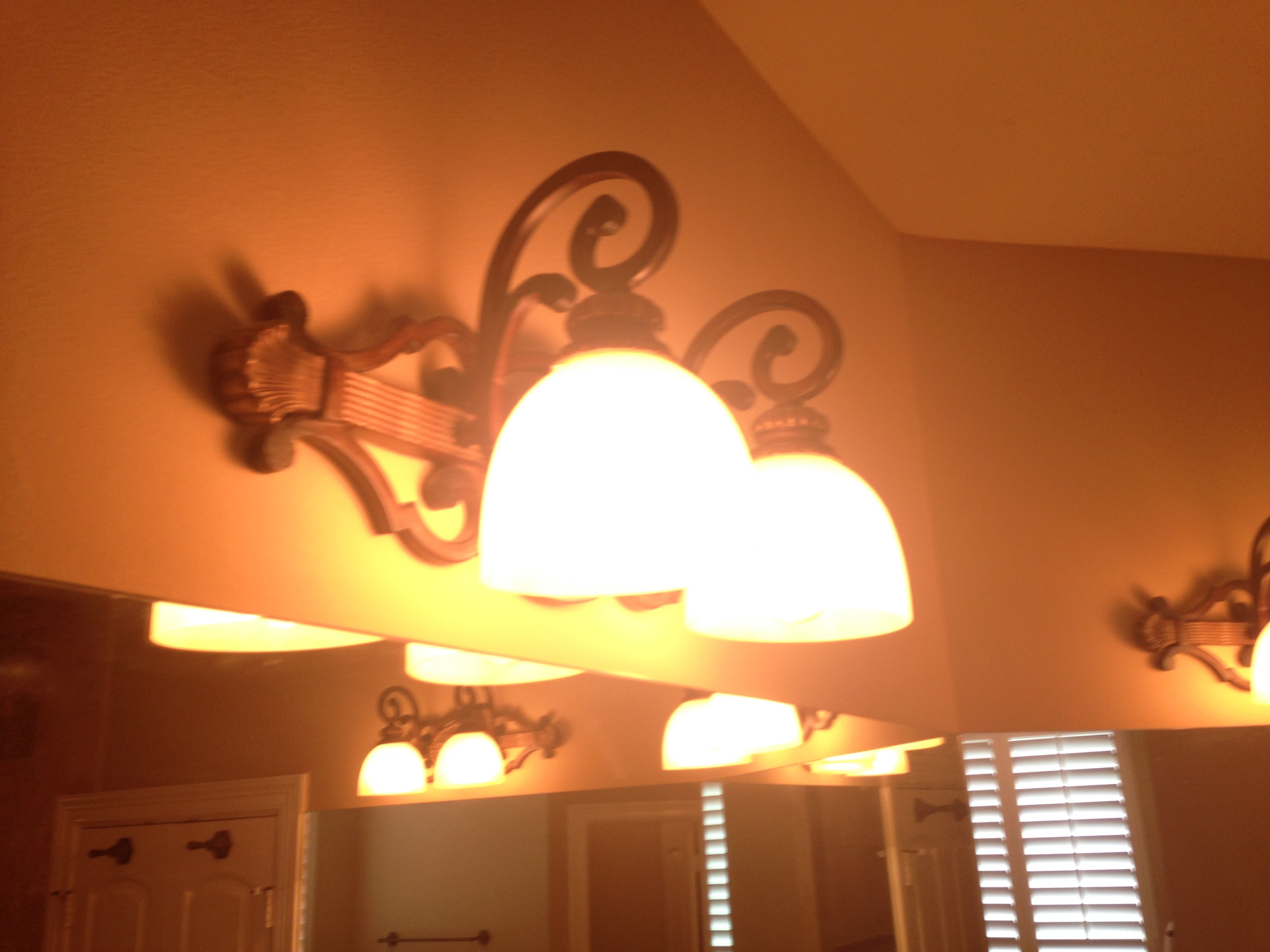
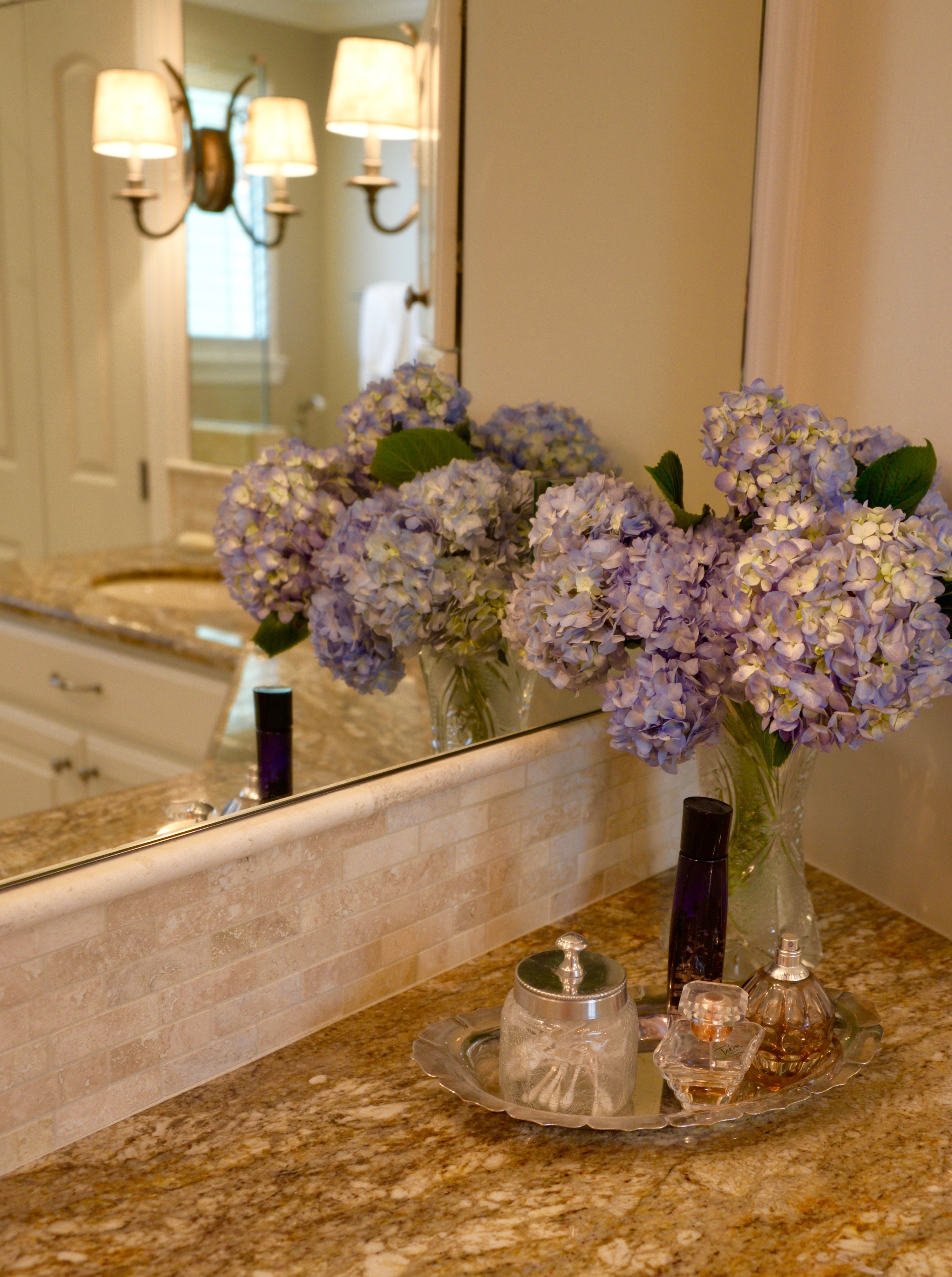
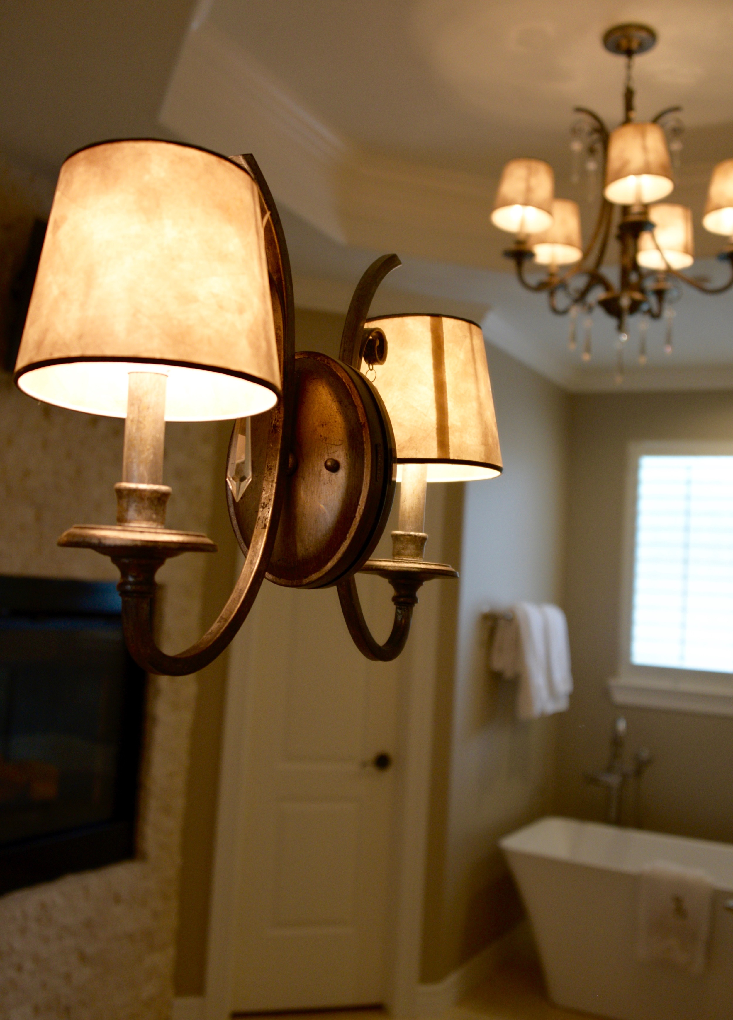
Lighting - Once we decided on a brushed nickel finish for all the new bath hardware, the existing lighting was too heavy, rustic, and Tuscan. We found sconces and a chandelier that are elegant and more delicate.
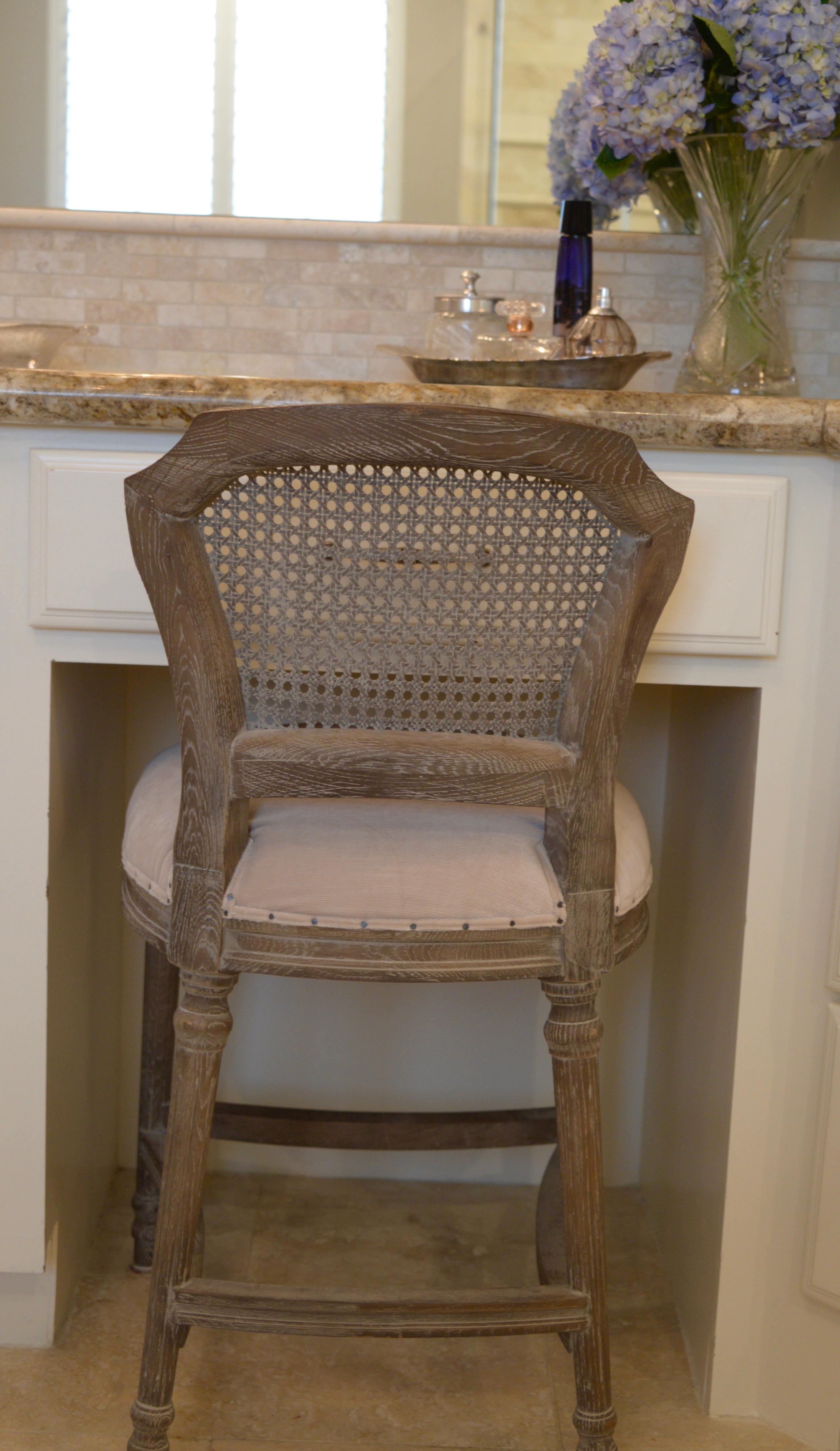
Vanity Cabinet Knee-space - Since we were keeping the existing vanity cabinet, we brainstormed with the contractor to remove one section of cabinet doors and create a knee-space for a makeup area! I think this is one of the most clever and functional changes in the room.
Vanity Upper Cabinet - We all know that beauty products and toiletries take up a lot of space. By adding a cabinet from the countertop to the ceiling, the storage area was dramatically increased. We also felt that the cabinet created a nice separation between "his" and "hers" sinks, without closing off the space. That corner was awkward to begin with, so this was a great solution.
Mirrors - The existing mirrors only went up a portion of the wall, and were not framed at all. New mirrors from the countertop to the ceiling make the room feel much more grand and luxurious. The new mirrors were extremely impactful!
Bath Hardware and Cabinet Hardware - Again, brushed nickel was our finish of choice to keep things feeling soft and light. And adding cabinet hardware was a must....it is my pet peeve when cabinets do not have knobs and pulls!
So take a look at the finished product......
AFTER


Dreamy, isn't it? I loved collaborating with my parents on this project, and I know they certainly deserve a beautiful space. Let me know what you think in the comments below! I would love to hear from you.